Mobile app design for Buengo (C2C marketplace)
Challenge
Solution
Based on UX best practices and user testing insights, I redesigned the app’s information architecture, user flows, and visual interface, accommodating distinct user needs (buying, selling, and campaign creation) within a shared experience.
Results
The work helped move Buengo from an early prototype to a production-ready mobile app, delivering a well-structured experience with validated navigation and user flows.
The project
Buengo was an early-stage product aiming to combine a second-hand marketplace with fundraising features for social causes.
When I joined the project, the team had already produced the first unfinished version of the app, with an initial version that required further work on user experience and interface design.
I started by focusing on understanding the different user personas and how they interacted with the app.
The main challenge was supporting two different services, such as marketplace and fundraising, within one product.
Project team
Oufela Hughes – Co-founder & CEO
Alex Hancock – Co-founder & CTO
Hana Gausfain – Product Designer
Katie Eldred – Marketing Manager
Early prototype
Buengo was designed to allow users to create a personal profile for selling and buying second-hand items, as well as launching fundraising campaigns either individually or for an organization.
NGOs, schools, and other associations could also have organization profiles that allowed users to create campaigns on their behalf. For the MVP, organization profiles were created and managed manually.
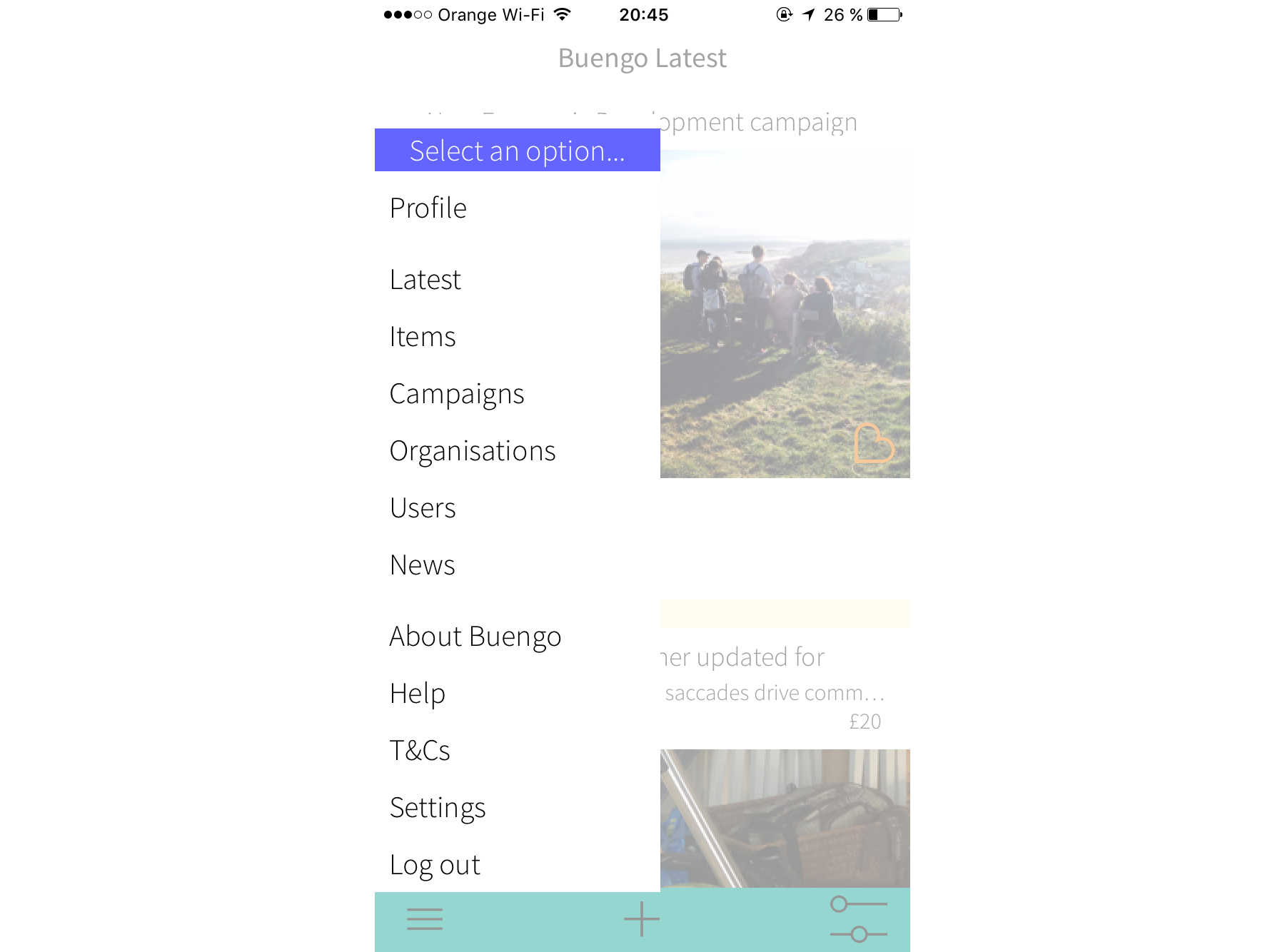
When I joined the project, the app was organized around a single feed that combined products, campaigns, users, and organizations, all presented at the same level without prioritization.
While the content could be filtered via a hamburger menu in the bottom navigation, this design made it difficult for users to navigate and quickly identify what was relevant to their goals.
Moreover, the “+” sign at the bottom navbar did not have a clear action associated.
Identifying the different Buengo users
To design an effective navigation and IA, I first needed to understand the different user goals so that I could prioritise the various actions supported by the app.
Based on prior research, we identified different user types among buyers, sellers, and fundraisers.
Within buyers and sellers, we could differentiate between those who were invested in a particular cause and wanted to raise funds or donate to it (engaged users) and those who simply wanted to declutter or look for a good deal (unengaged users).
Among fundraisers, we could also subdivide between individuals who ran their own fundraising campaigns (personal campaign), and organizations running their own campaigns or enabling others to fundraise on their behalf (organization campaign).
This analysis helped me define the different user flows.
Defining user flows and information architecture
Local second-hand marketplace flow:
As we just saw, we defined two types of marketplace users depending on their main motivation: supporting a cause or buying and selling items.
These insights informed the definition of the user flows. Engaged sellers would look for a particular campaign first, and then upload their product. The unengaged would focus on uploading the product first and then selecting a campaign to donate the proceeds.
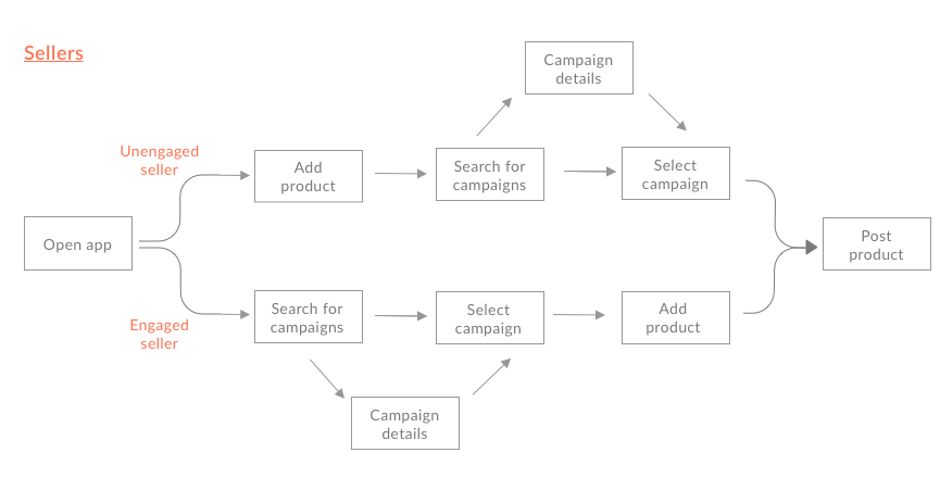
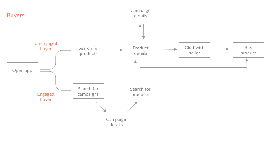
I applied a similar distinction to buyers: unengaged buyers would search for products first, whereas engaged buyers would start by browsing campaigns and then select a product to support.
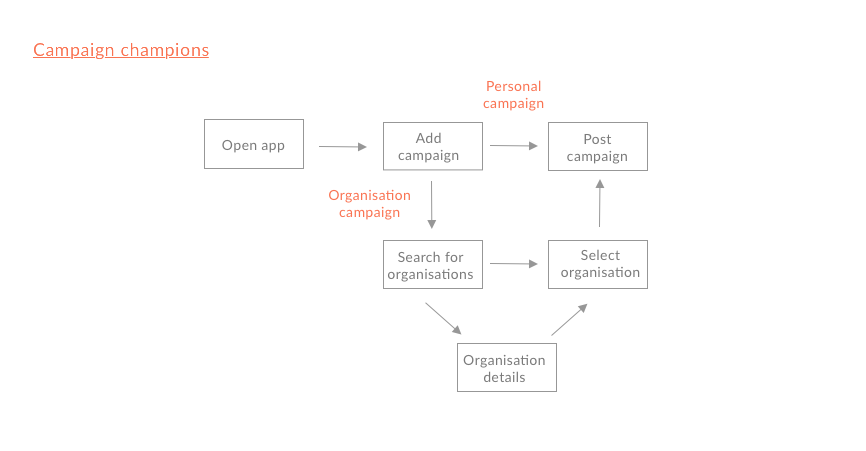
Fundraising platform flow:
Since organizations were registered outside the app for the MVP, for the fundraising flow, I focused on campaign creation by individuals (champions), either for a personal cause or on behalf of an organization.
To simplify the navigation, I defined a single starting point for campaign creation (Add campaign) and discarded the option to search for organizations first and then add a campaign.
Screen design
Home and navigation:
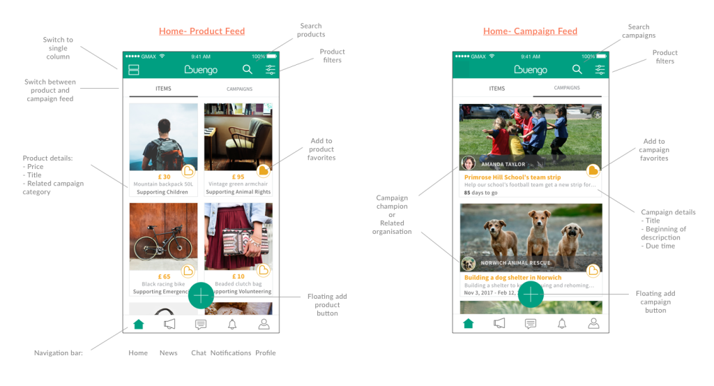
To support the two primary discovery behaviors identified earlier, product-first and cause-first, I designed a two-tab home screen separating items and campaigns. This allowed users to start from what mattered most to them without mixing unrelated content in a single feed.
Each feed included its own search and filtering controls, along with a floating “add” button to allow quick posting for sellers and fundraisers.
Item cards used a two-column layout to improve scannability and support quick browsing. Each item also displayed its related campaign category, giving unengaged buyers immediate context about where the proceeds would go without requiring deeper navigation.
All main sections were placed in a bottom navigation bar to provide direct access to the main actions and reduce friction compared to the first version, which had a hamburger-based navigation.
Product detail and purchase flow:
The product detail screen combined product, seller, and campaign information in one place, reflecting the dual nature of the app as both a marketplace and a fundraising platform.
Because Buengo charged a transaction fee, transparency was a key consideration in the purchase flow. I designed a payment breakdown screen that clearly explained how funds were distributed, helping set expectations and reduce potential friction at checkout.

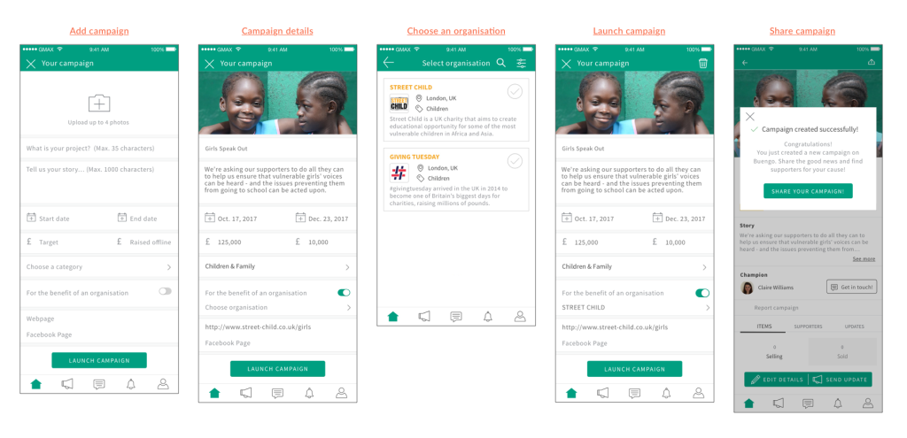
Campaign creation:
On the campaign creation form, I used a more conversational copy to guide users through the process, rather than relying on generic field labels. This was particularly useful for first-time fundraisers unfamiliar with launching campaigns.
To support both personal and organization-based campaigns, I introduced a simple switch that allowed users to select an organization when relevant.
User testing and iterations
Before moving into final mockups and development, I conducted usability testing with second-hand marketplace users and charity employees.
I prepared two interactive prototypes to cover the main scenarios: purchasing a product and creating a fundraising campaign on behalf of an organization.
Testing showed the app was intuitive and easy to navigate. Buyers approached product discovery in different ways: some searched and filtered products from the main feed, while others started from the campaign feed and explored related items to a particular cause. This behavior validated the buyer flows defined earlier.
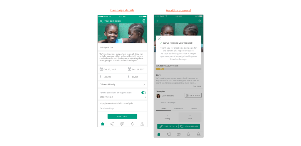
On the other hand, charity employees highlighted the need for campaigns created on behalf of organizations to be reviewed before publication.
Based on this feedback, I introduced an approval step for organization managers and adjusted the campaign flow accordingly: selecting an organization changes the primary CTA to “Continue” and clearly communicates that the campaign is pending approval.
By focusing my work on bringing clarity by defining the information architecture, user flows, and core interactions, I helped turn a complex idea into a usable foundation for the first MVP.
Client feedback
Hana is a great designer, not only as a creative UX writer and content designer, but also as a researcher and creative person.
She goes above and beyond her duties, crafting high-level deliverables, dealing with clients, understanding project needs, and keeping challenges focused on the right path. Inspiring us, challenging us and making us all progress.
Hana’s approach to redesigning our application was methodical and user-centered. She quickly understood our users’ needs and translated that information into a design that has significantly improved the experience.
Next steps
Once we had all the screens mapped out, I also contributing on generating the assets and copy for the app store description and collaborated with the marketing manager to plan the launch. I also supported the QA phase by creating test scripts and reviewing feedback, which informed design iterations planned for the next version of the app.